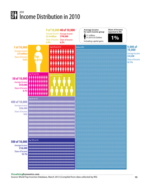
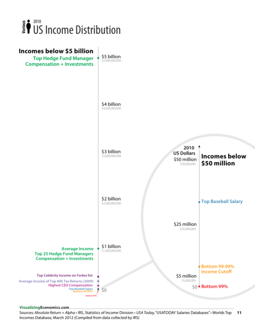
During the course of making my book, I tried to solve the problem of representing the extreme income inequality in the United States using several different graphic approaches. In some cases, I was working with a single data set like The World Top Incomes Database or the Congressional Budget Office. In others graphics, I combined this data with data from Forbes, IRS, and AR: Absolute Returns + Alpha.
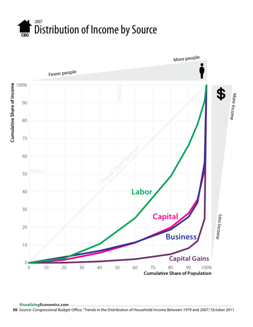
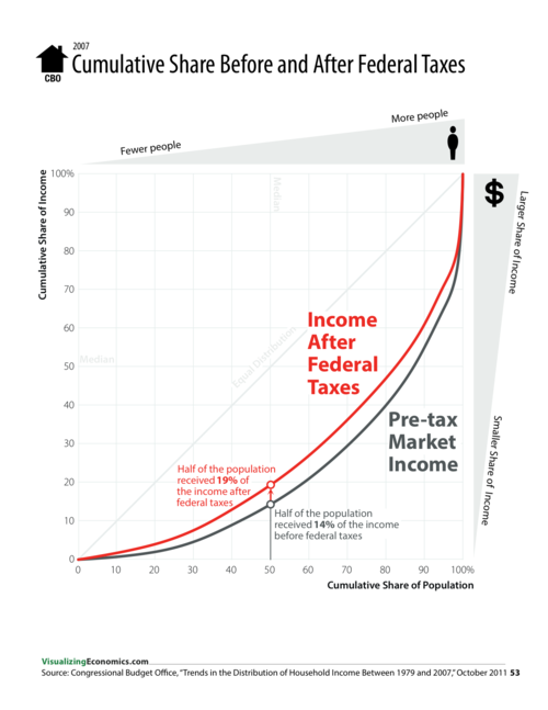
Treemap was created using R and the people icons were added in Illustrator, while the cumulative share graphs and the dot plots were create in OmniGraphSkecher.


AN ILLUSTRATED GUIDE TO INCOME IN THE UNITED STATES is now available! A comprehensive collection of infographics, maps and charts looking at the history of incomes and occupations in the United States.


No comments:
Post a Comment